
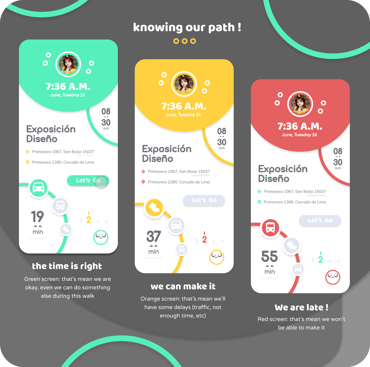
The development stage of both Barry and Phil was where Barry especially really ‘clicked’. We knew we had to pitch two different concepts to Barclays during our Drop in pitch, so the challenge now was to not overlap and develop them into basically the same idea. As they are both named ideas, both involve a character as such, we had to ensure we differentiated them clearly.
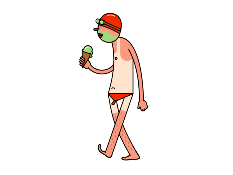
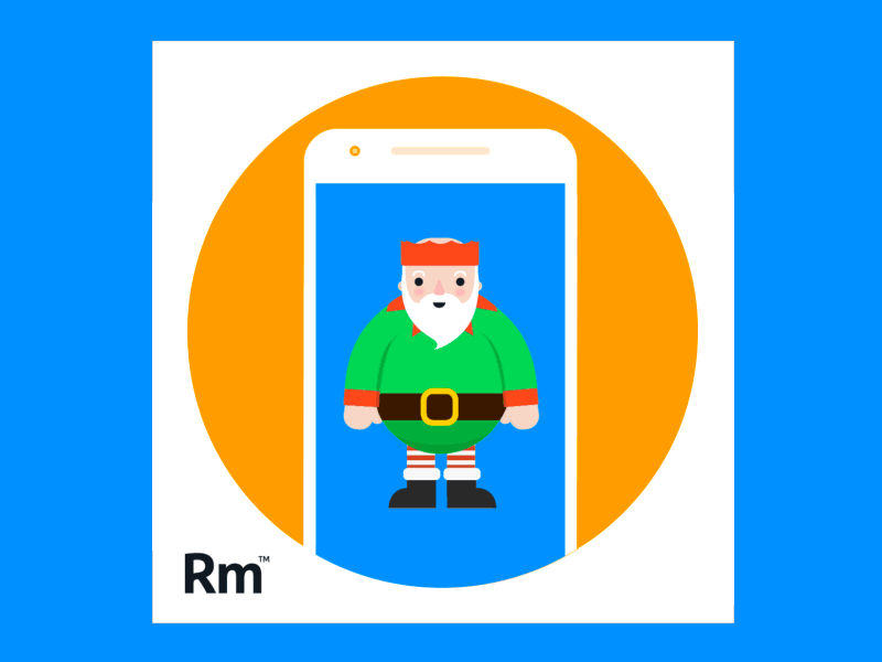
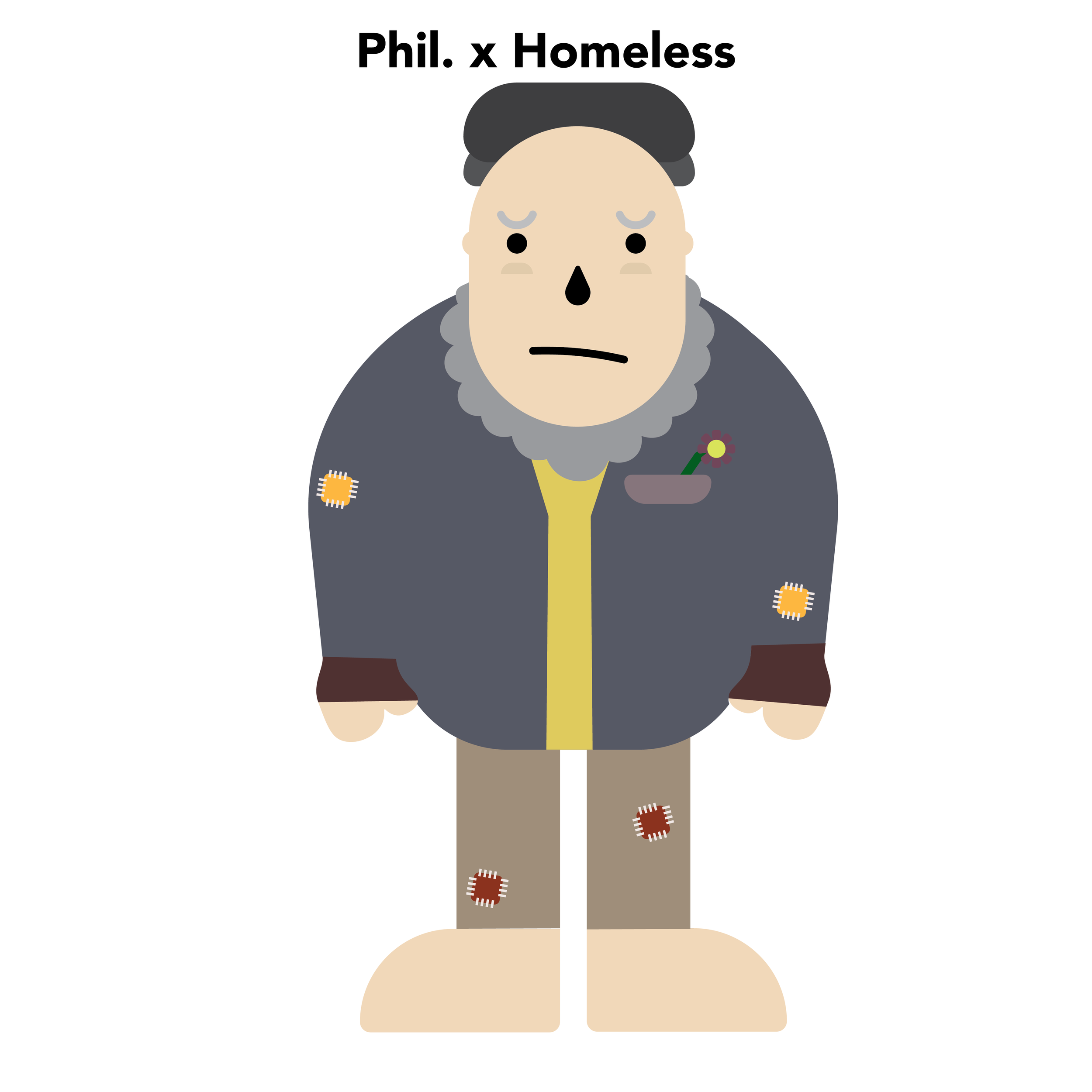
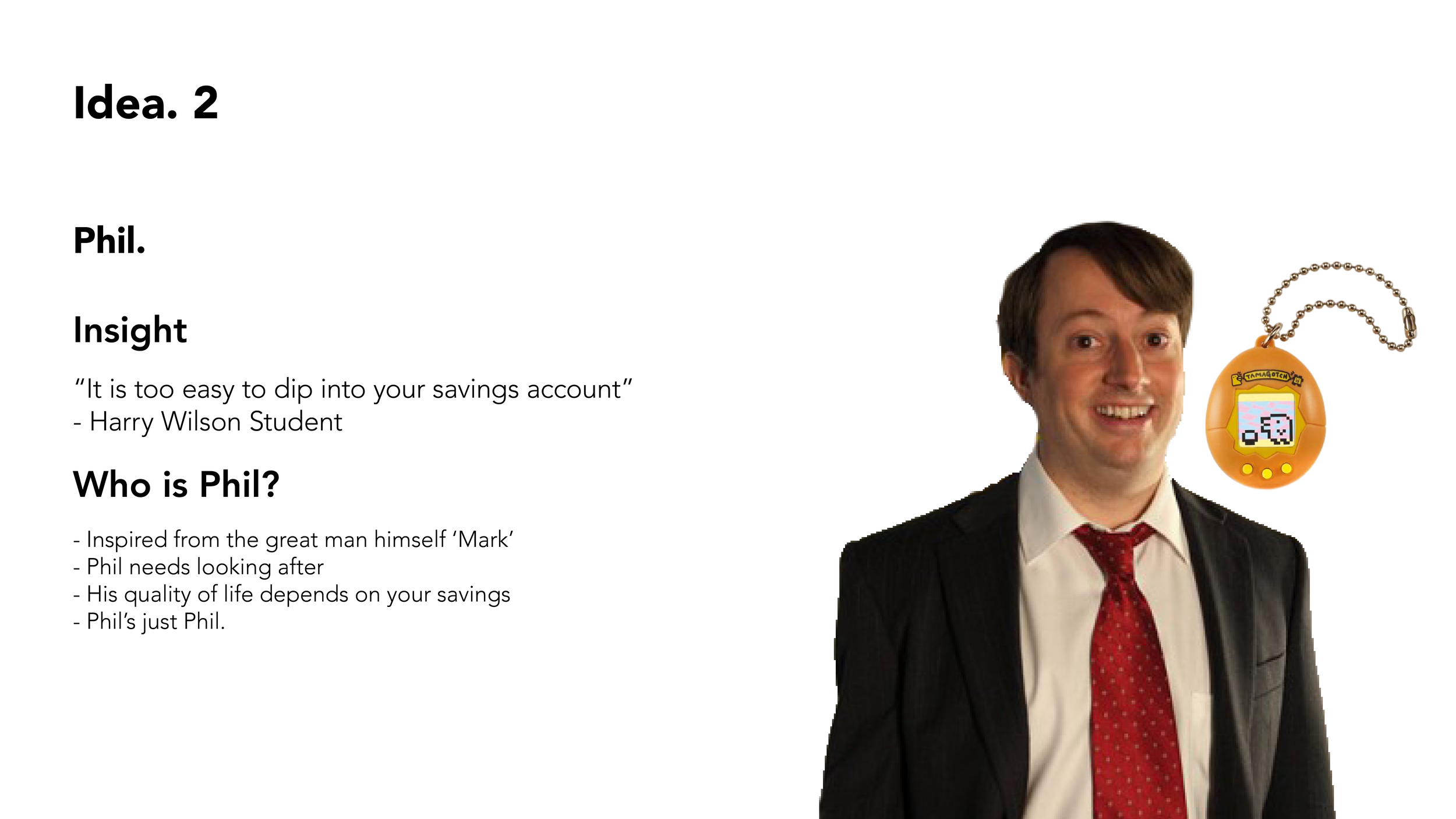
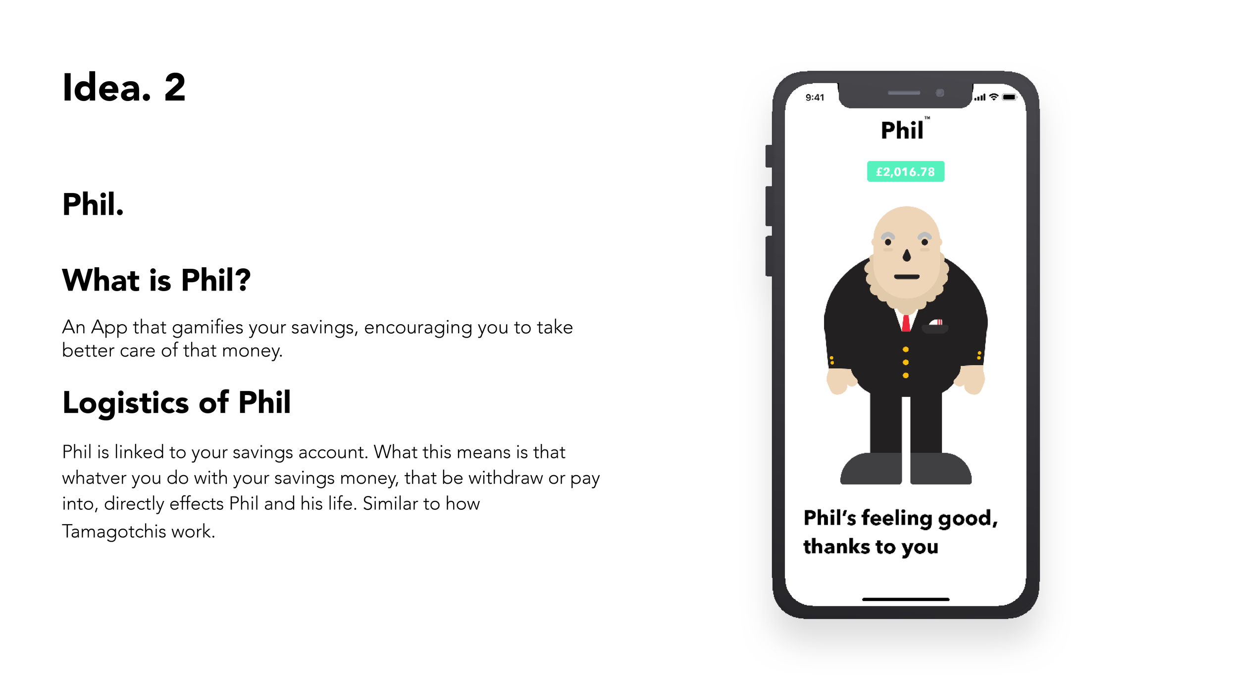
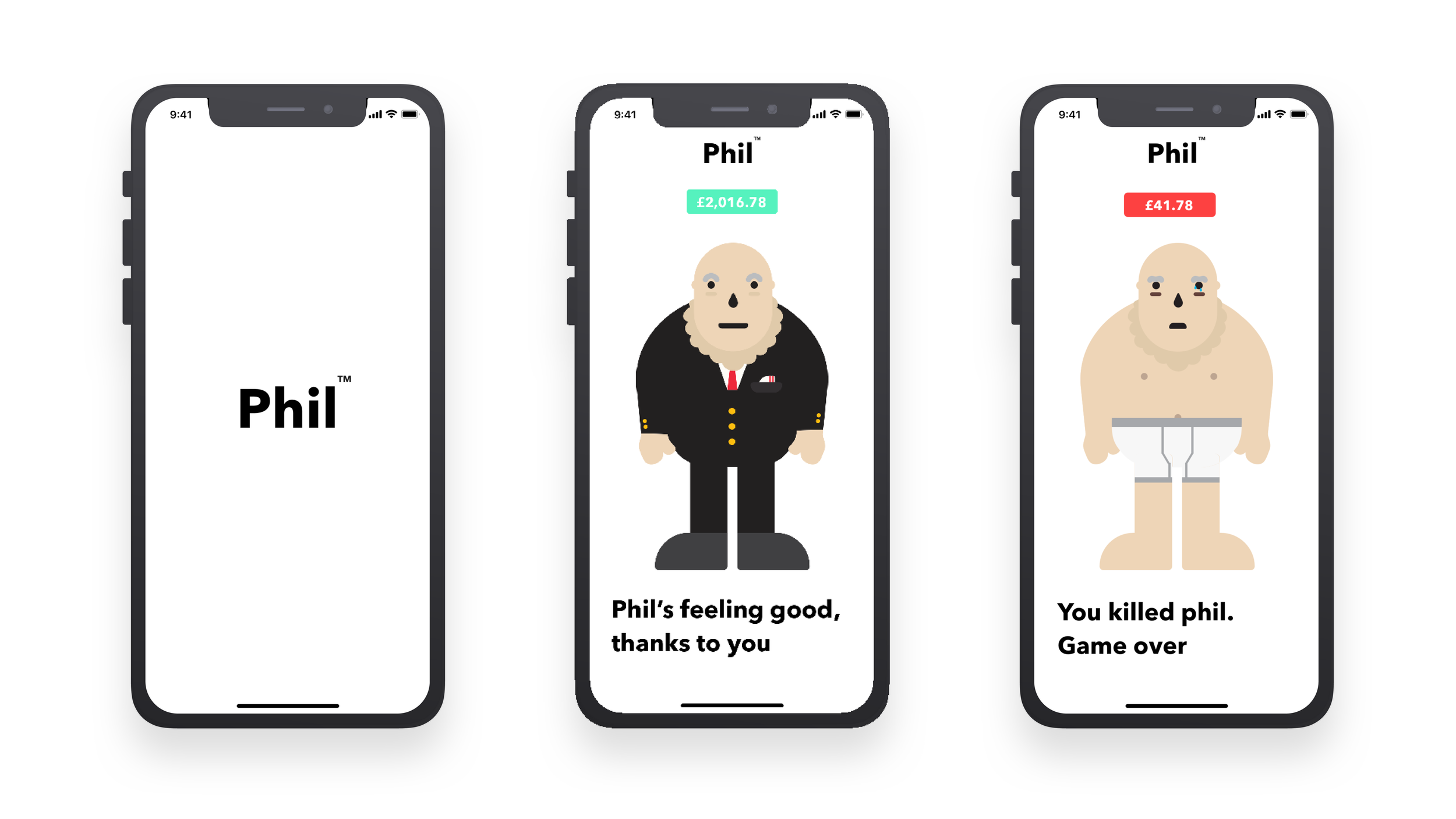
To begin with, Phil when we pitched it to Brian and Xavi was an idea revolving around a virtual character whose quality of life reflected through your savings balance. We had to think of how we could reflect this happiness and sad status, we did think about using emojis as millennials are heavy users of these to communicate. But the issue with emojis was it would be too static and limited, plus it would not have a very long life span as an app if you only ever saw emojis. The option we eventually went for was to choose a base character, in our case a overweight old man, of which his clothes/outfit would transition to a worser state every time you withdraw money from your savings. The opposite would occur if you did not withdraw money from your savings for a certain amount of time. We decided on this style through research and getting inspired from a few illustration led references featured below. With this design direction, it keeps it simple and its connecting with the user on an emotional level, the more you take from your savings, the worse Phils going to look. Also with this outfit led direction, we thought for the future as promotional material, a short video advert of some uni lads in a pub and one needed to take some money out of his savings in order to afford his round, but as he goes and takes it out from the account, there is a reminder from phil of what he could look like if he went ahead and withdrew some money. With the uni lad having to tell his mate, ‘ah I can't do this round lads, Phils not looking very good as it is..’ There is some witty material for promotion involved with Phil.
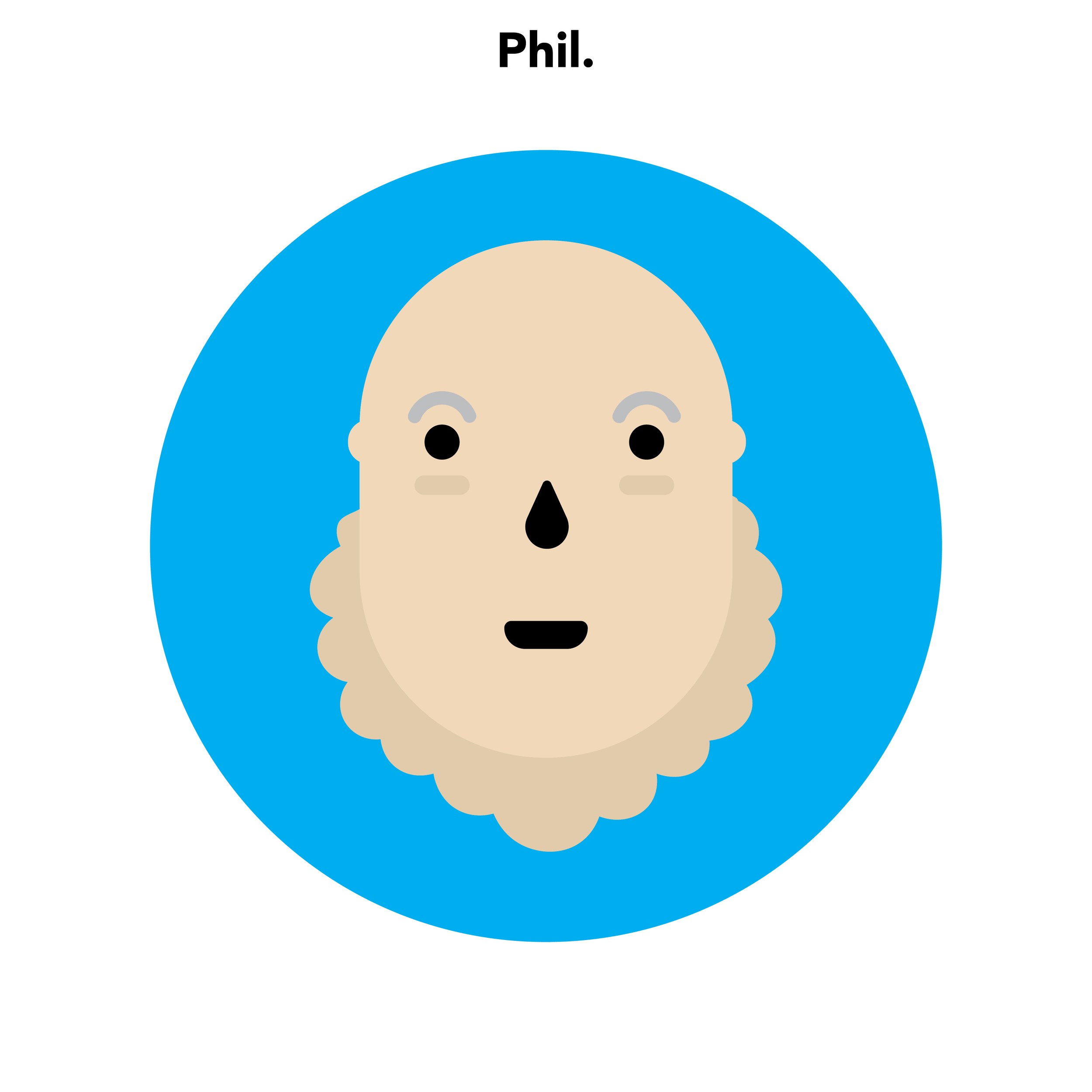
Below is the different versions of Phil we created before getting to our final version, Illustration is not our strong points as you can clearly see.

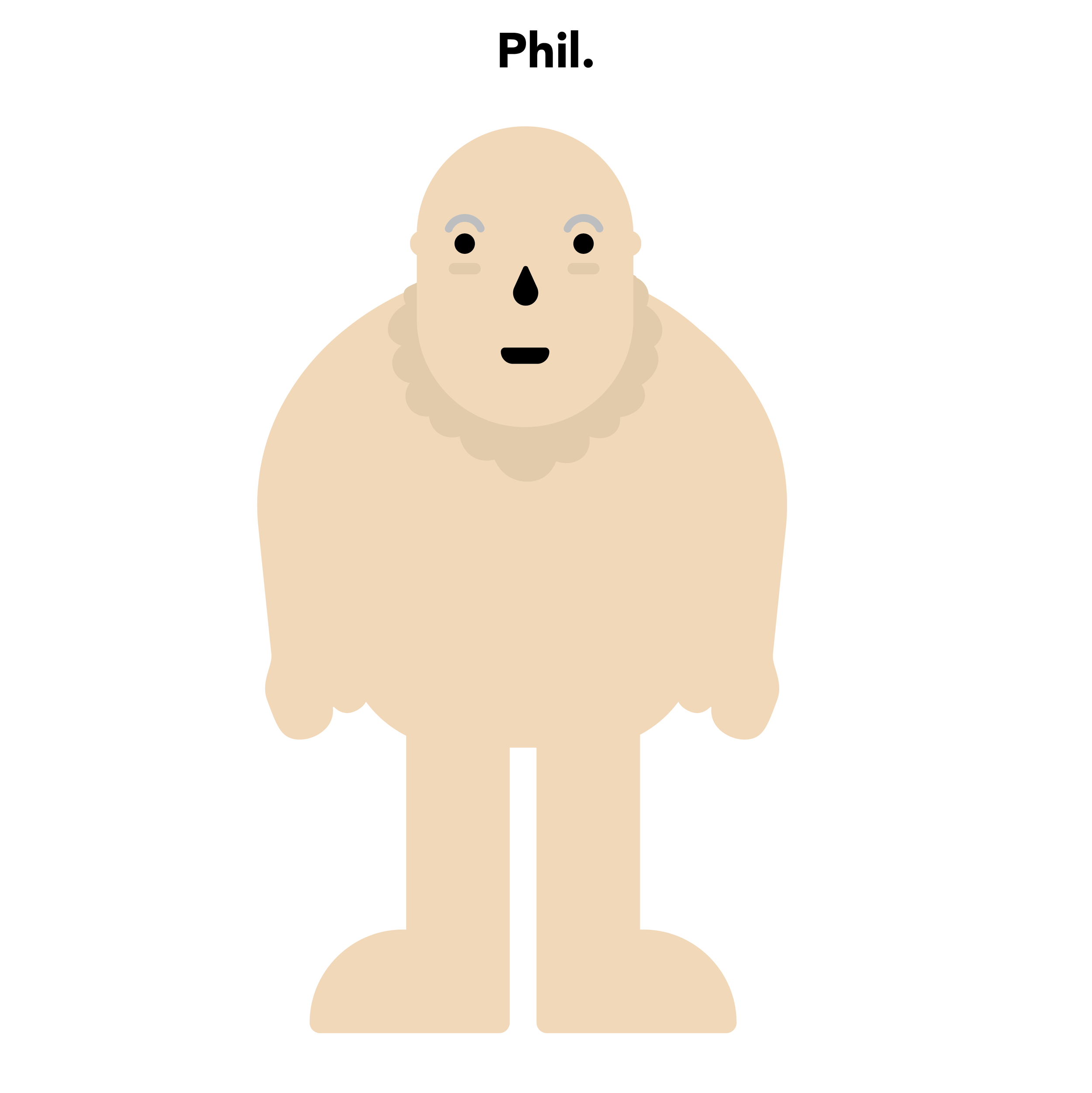
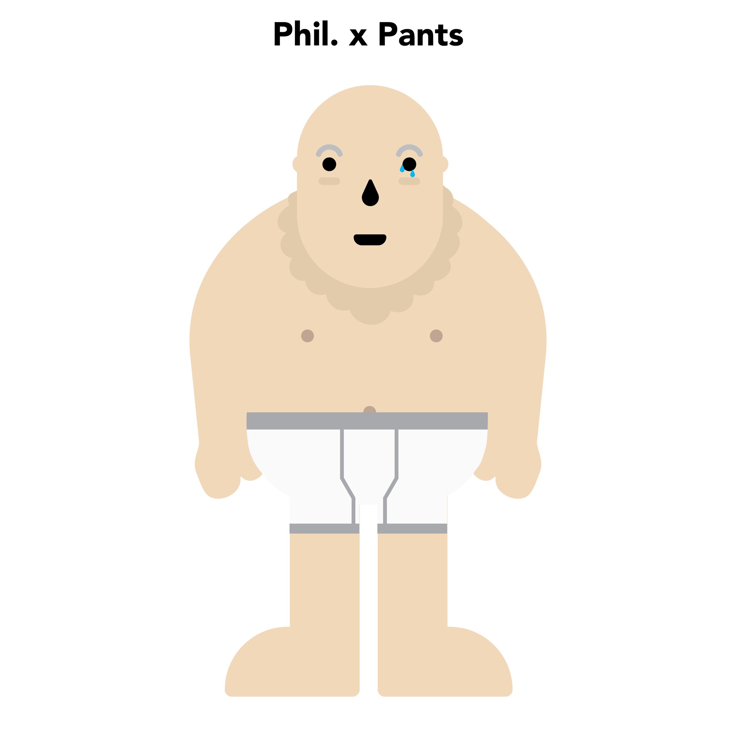
Below is the final versions of phil which we pitched to Barclays during our Drop In Pitch. As you can see we based it off three different costumes to reflect levels of life.

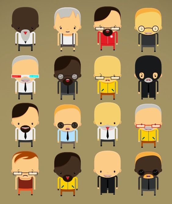
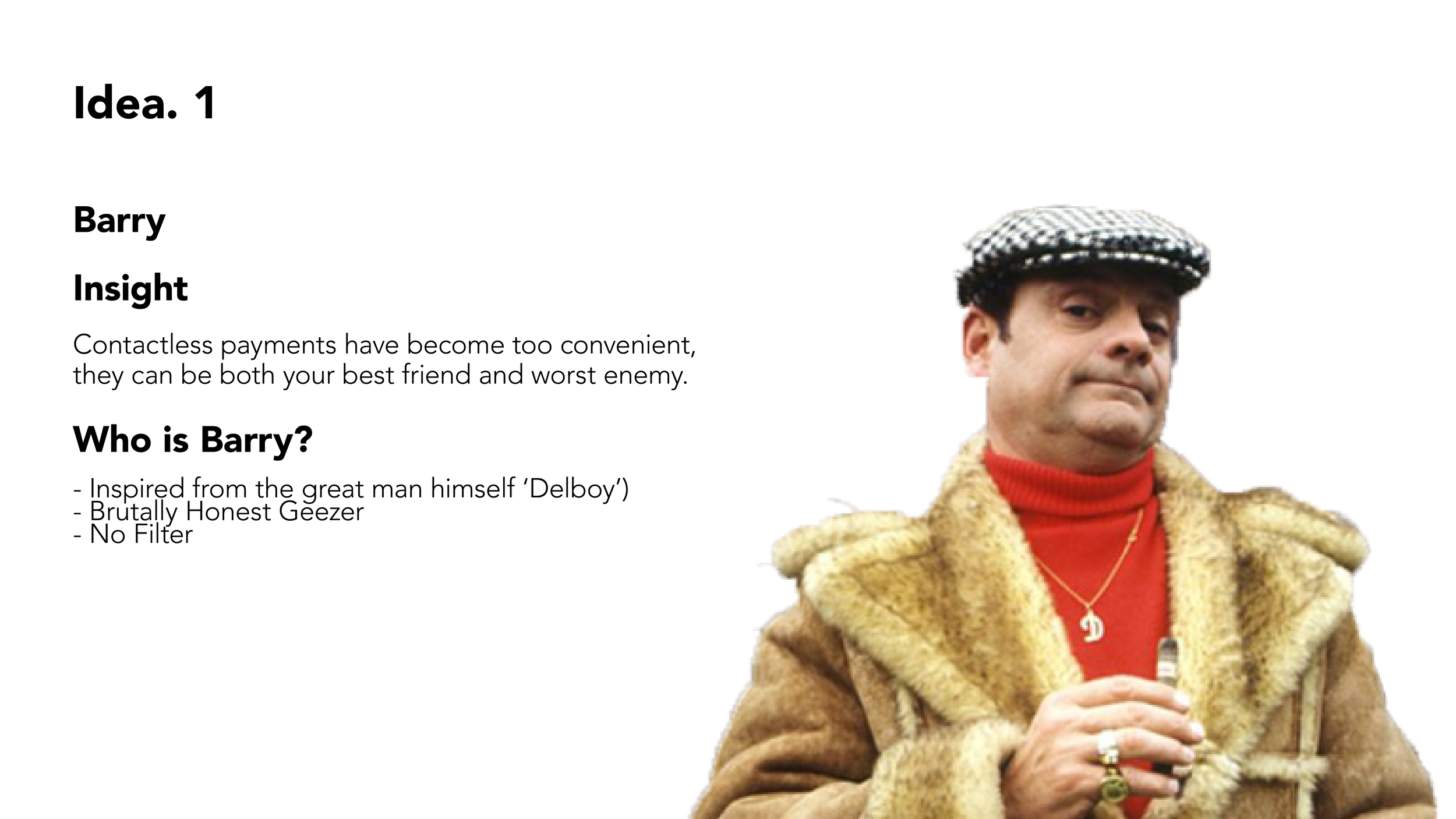
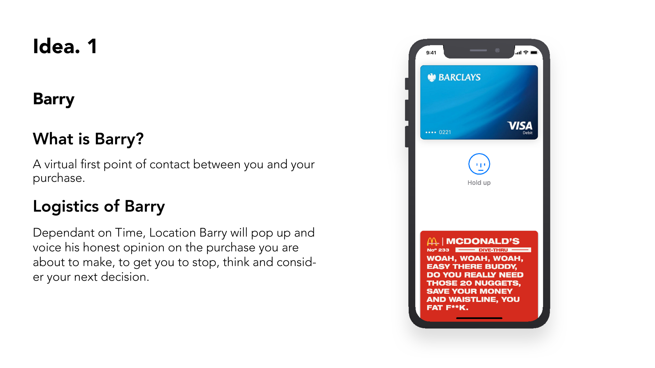
Now onto Barry and his development. Barry where we left off from our pre pitch check in with Brian and Xavi was at the stage of being a simple pop up illustration character who appeared before every contactless purchase. This was the ‘Click’ moment for us and Barry. The first turning point involved us attempting to illustrate Barry as a head and shoulders character, which was both extremely frustrating and average as illustration is not either of our strengths. It took us to create version 1 of Barry below, for us to proof it and refuse to go down the illustration route. We then attempted to create Barry in a clean design led app involving coins and minimal stroke illustrations. Of which we asked Derek for his opinion on, and his feedback was extremely beneficial leading us in correct direction finally!. He said that Barry needs to have his tone of voice at the forefront of the concept. Going for a clean design led approach looks nice but has no purpose, it doesn't deliver the True Barry to the user. He also commented and said how Barry is all about the copy, How Both Harry and I are into our typography so he said why don't we just stick to our strengths.

BARRY BEFORE WE SHOWED TO DEREK

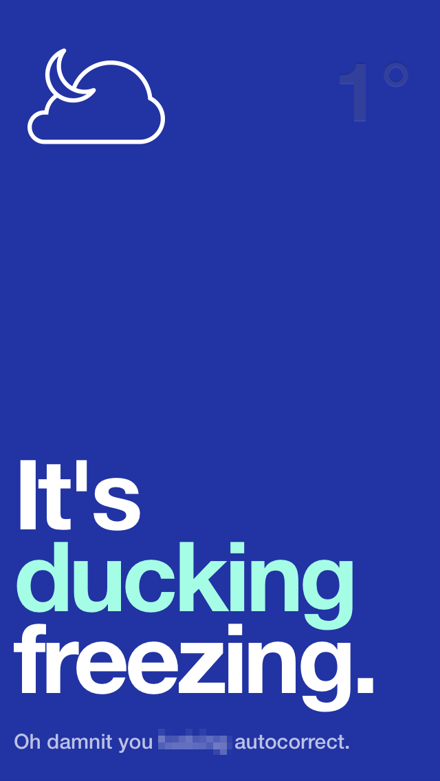
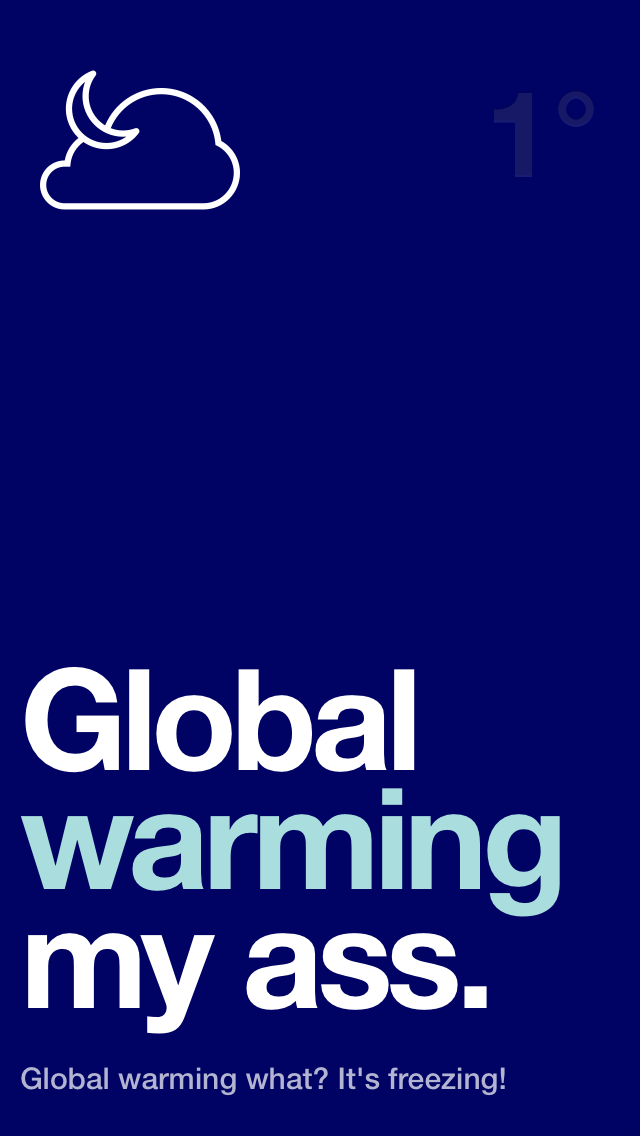
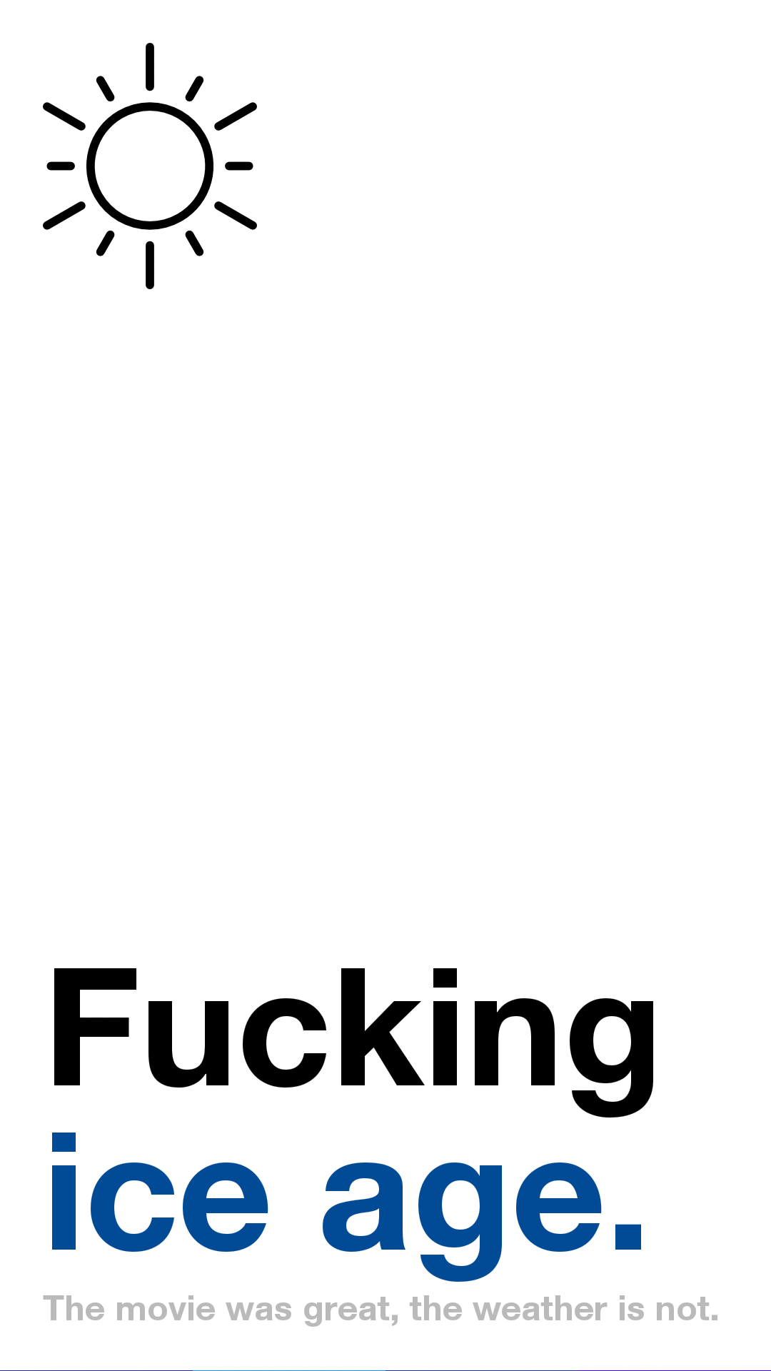
We scrapped this approach and took Derek's advice. We decided to use our copy to portray Barry. So we used the Authentic Weather as a massive inspiration of how we would execute Barry going forward. As you can see below the design direction of Authentic Weather is using the copy as the main element with a clean layout, something we wanted Barry to be.
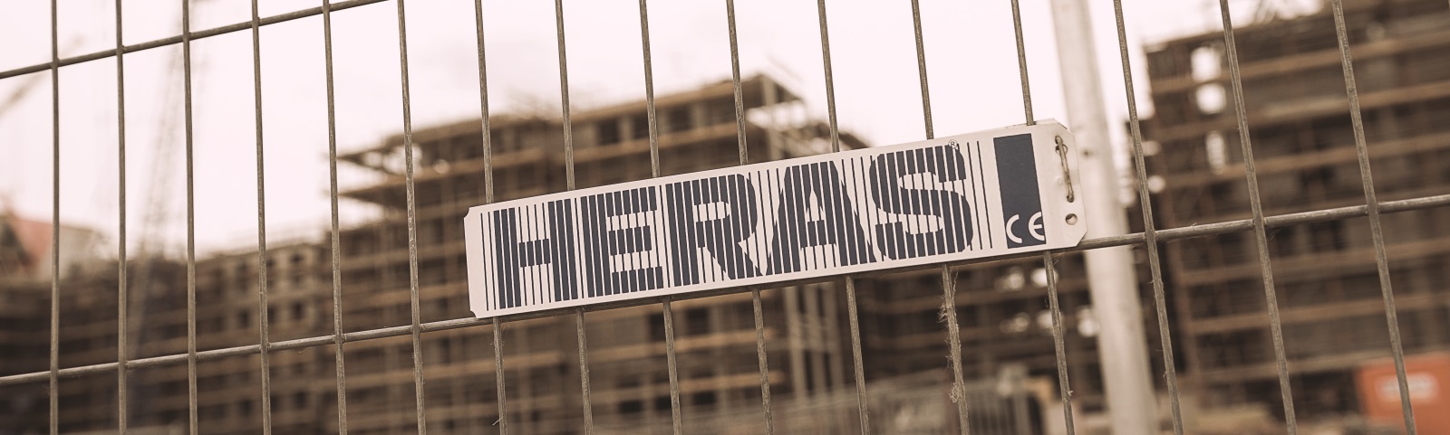
With derek's advice being our massive eye opening moment, we ran with the idea of Barry being a copy typography driven idea. The way we executed Barry and his copy was through virtual old school style tickets which popped up in your wallet. This way we kept it simple and clean, not making it complex by involving its own application. In terms of typography choice, we thought about where Barry would work, what sort of environments he would be in if he was a person. Which was where we found our font, on Barrys building site. We looked around various building sites and the trucks going in and out, and they were covered in block sans serif style fonts similar to Heras Fencing Branding. Using a bold font inspired off of Barrys workplace we felt tied in nicely, as well as looking appealing on the actual cards.
Copy was a massive element of Barry, we needed to talk in Barrys tone. Very Geezer led, harsh, sarcastic, full of jokes and in a language which would connect with young adults. We decided seeing as we are the target audience, Students truthfully communicate with each other in a very brutal and harsh sarcastic manor, which fitted Barry down to the ground.

After a good week of branching the both ideas out, we finally had two refined ideas ready to pitch to Barclays for them to hopefully pick on to take forward and develop further. Phil has changed from being an emoji led concept to an actual old overweight man whose outfits change depending on the state of your savings account. Barry went on a windy road of trial and error but eventually reached its strong point, going from a head and shoulder illustration onto a fancy design minimal approach for it then to be shutdown and transformed into a bold copy led ticket system. Which we really, really liked the look of.


Drop In Pitch Deck