
The fourth stage of Berguna was the production stage, probably the stage where everything definitely came to life. This step was the most exciting as I finally was converting all of my ideas into actual visual elements. It involved a lot of time and decisions to get it right and to reflect the brand correctly. Overall with the design before I get into things, Berguna was all about clean slick design with a hybrid of sarcastic witty sly humour.
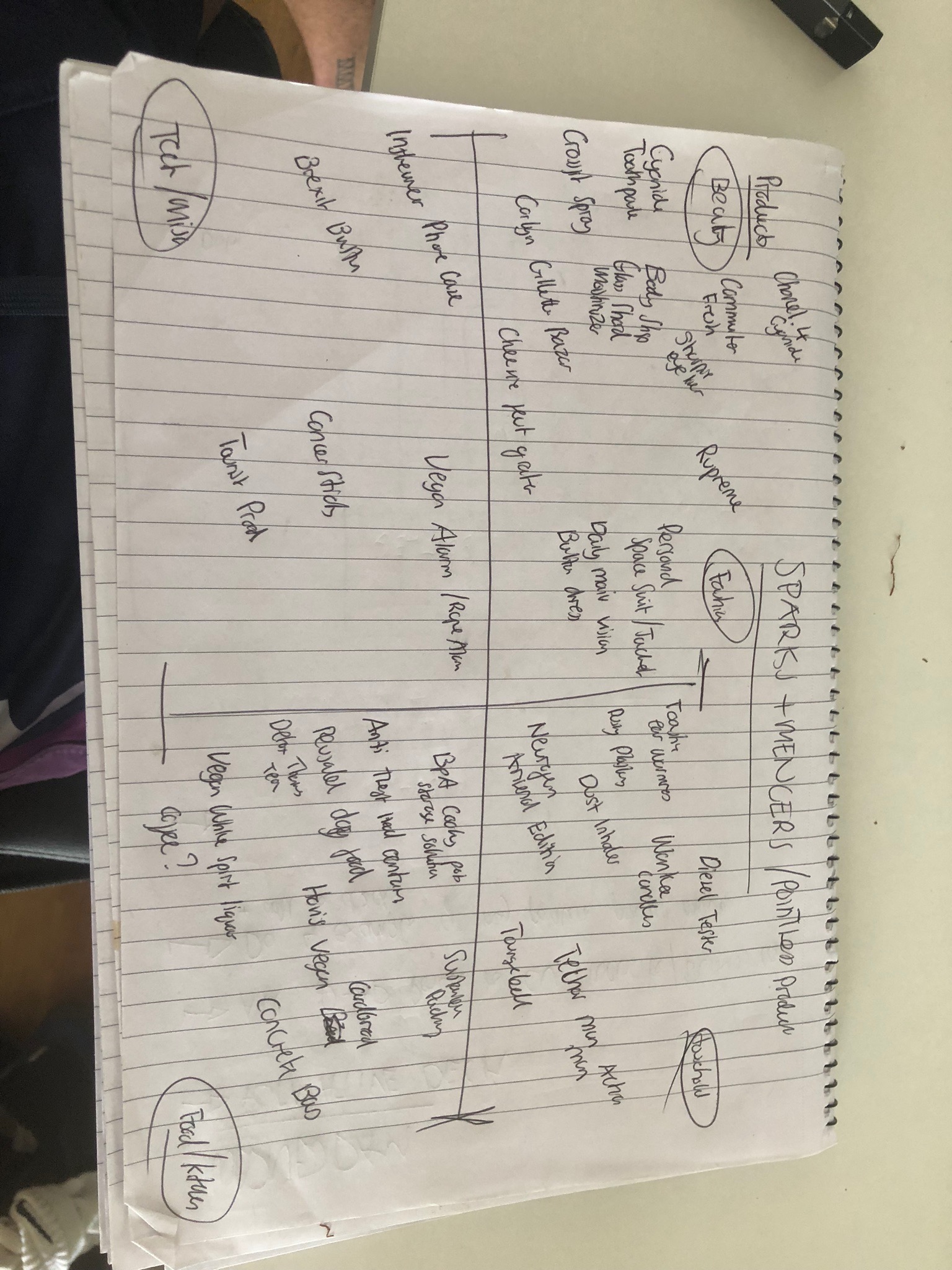
To begin with the production process for the outputs of Berguna. I did a quick makeshift graph type thing to see what categories my products sat in. One of the decisions I had to make with regards to how my online website store would function was what categories to split my shortlisted products into. I chose Home, Work, Travel, Leisure and Beauty.
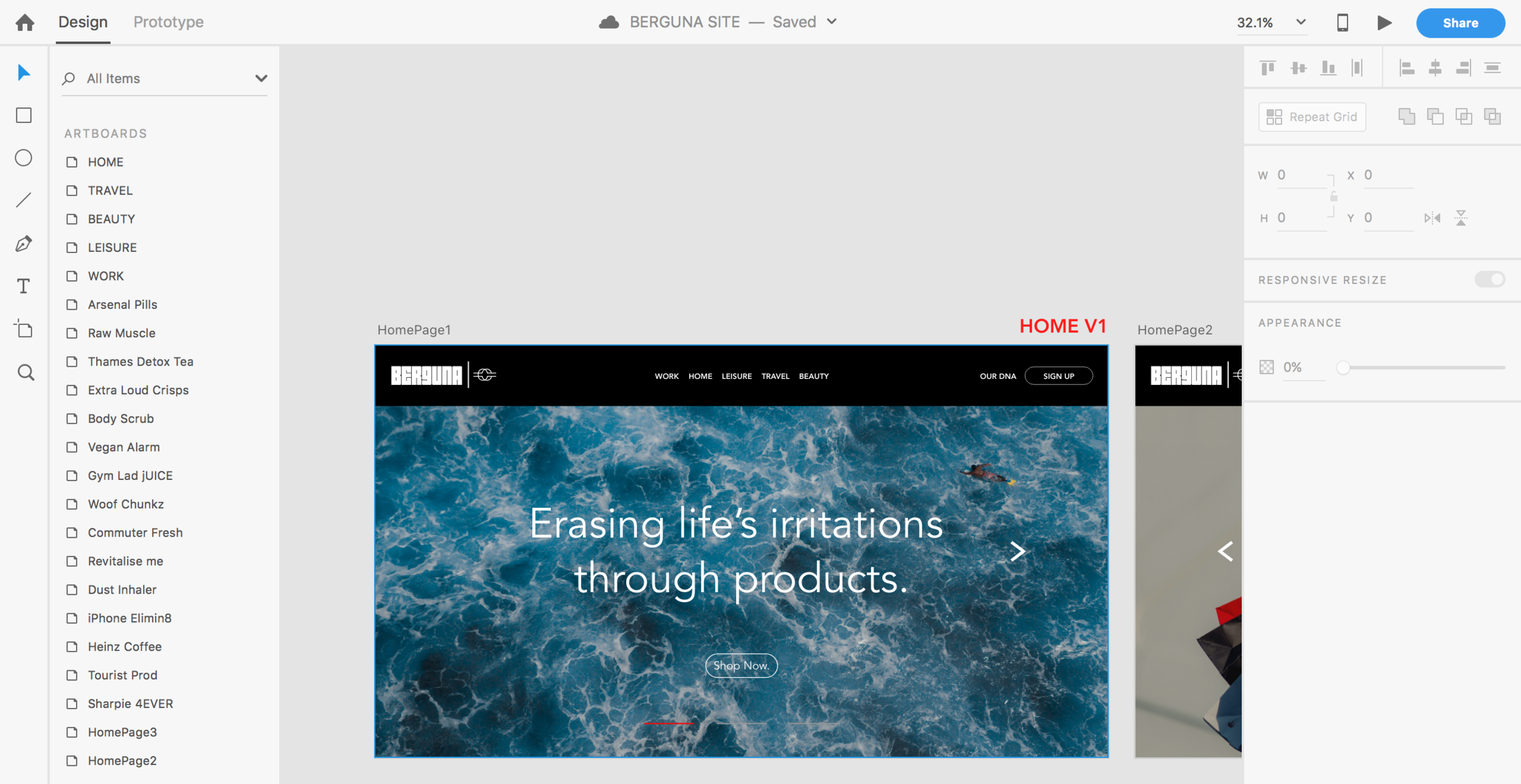
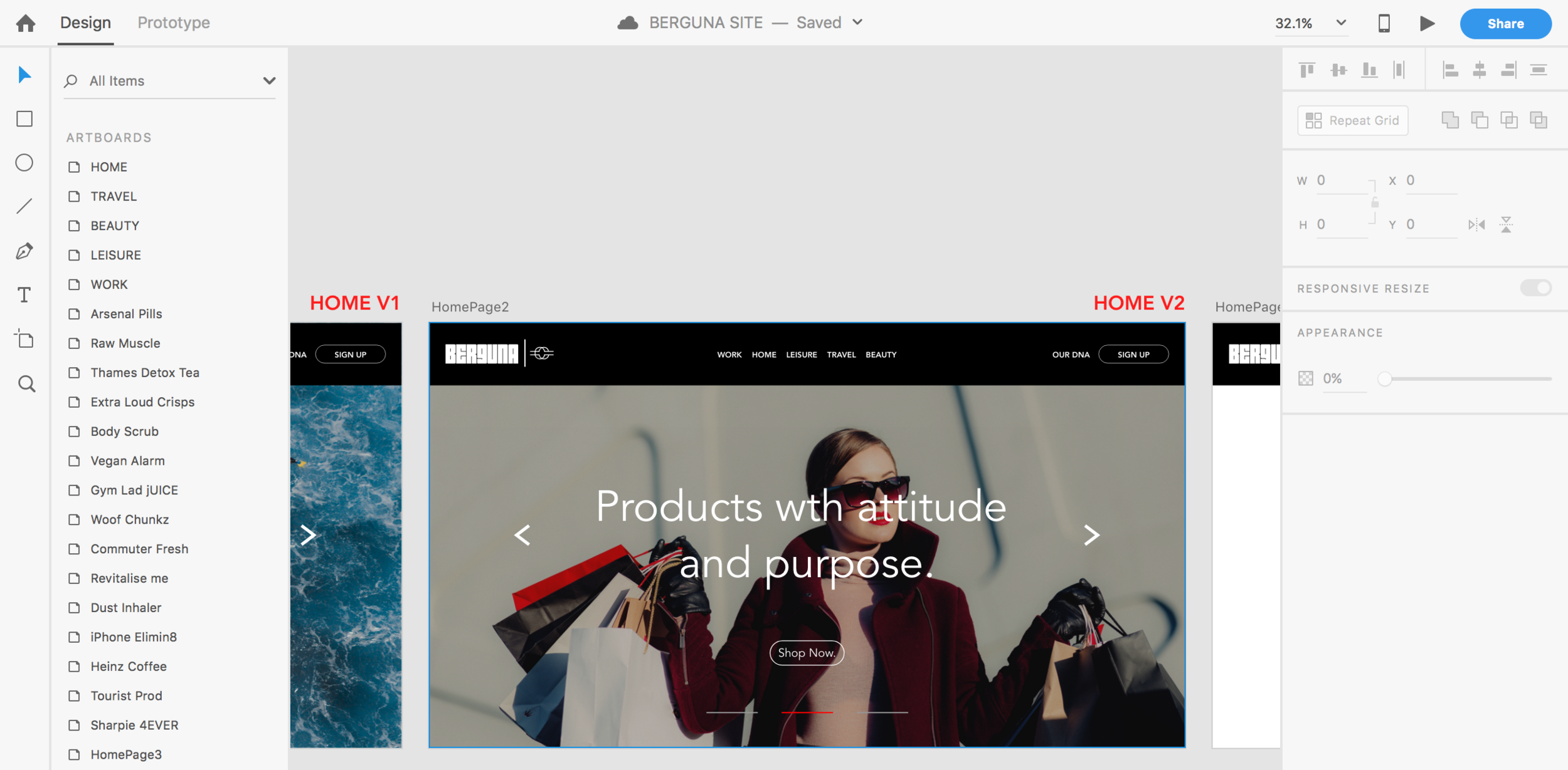
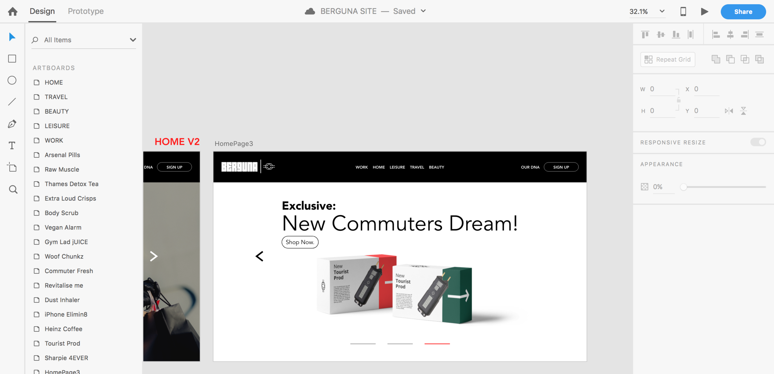
I began the production stage with the website UI/UX design. One thing I will say was that at the beginning of this project Berguna, I knew that this wasn't going to be easy or my usual type of design piece. I had never ever touched on UI/UX design. So it was all completely new to me. I decided after speaking to a Tayo my classmate that Adobe XD was the most efficient piece of software to execute this output, as XD is solely for designing apps, websites etc. So you could say this was taking a risk using a software I was unfamiliar with but I can safely say I have learnt and added a new bit of software to my locker which I am glad I have done, as this bolsters my skillset going into my full time creative and design position starting in July. The home page design was fairly straight forward as I stuck to my usual rules when designing of piecing together a simple but professional style. As I am a strong believer of only creating work with a purpose, not just to look good. In terms of the basic template I went for the Berguna logo in the top left, with the main categories in the upper center then the Our Dna section far right. This will be on every page allowing the user to easily navigate themselves around the site.
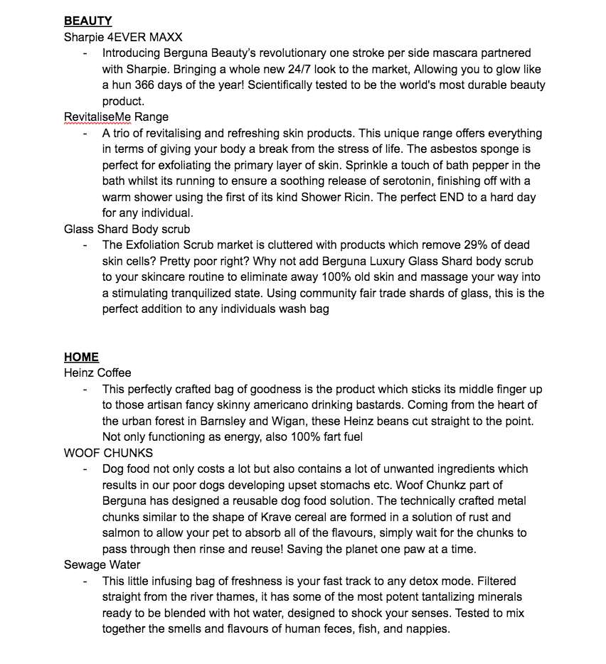
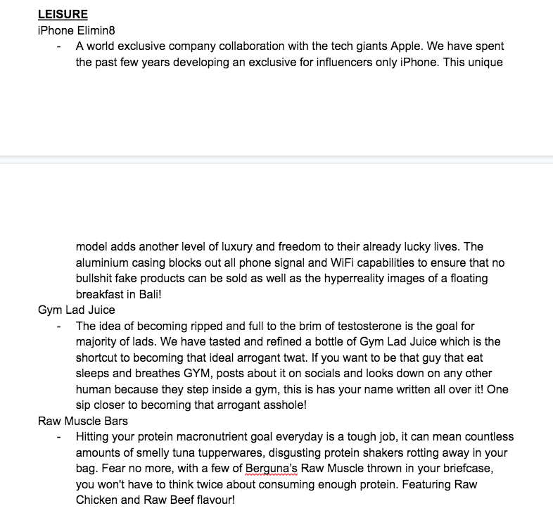
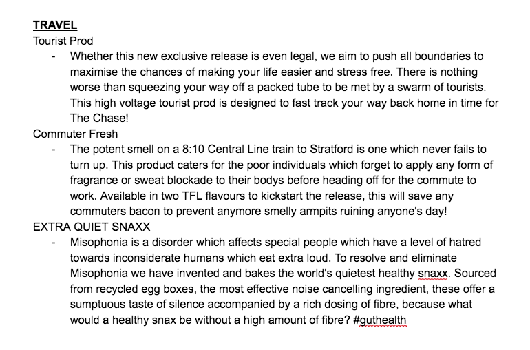
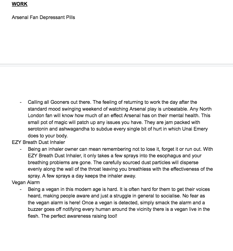
When designing the shop section for each product I gained an insight into product presentation via John Lewis with their individual product pages. Soon did I realise if I wanted to execute it similarly, I needed to generate a paragraph each for every product. Above you can see the document which I wrote for each product. I mixed in a combination of humour and sarcasm with some seriousness. Using intriguing words to tise customers into and tap into a small story of each product. As the products are the part of the project which communicates a personal story of my personal irritations in life. So the creative copywriting was key.
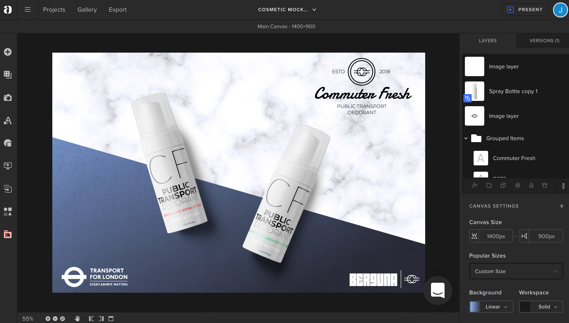
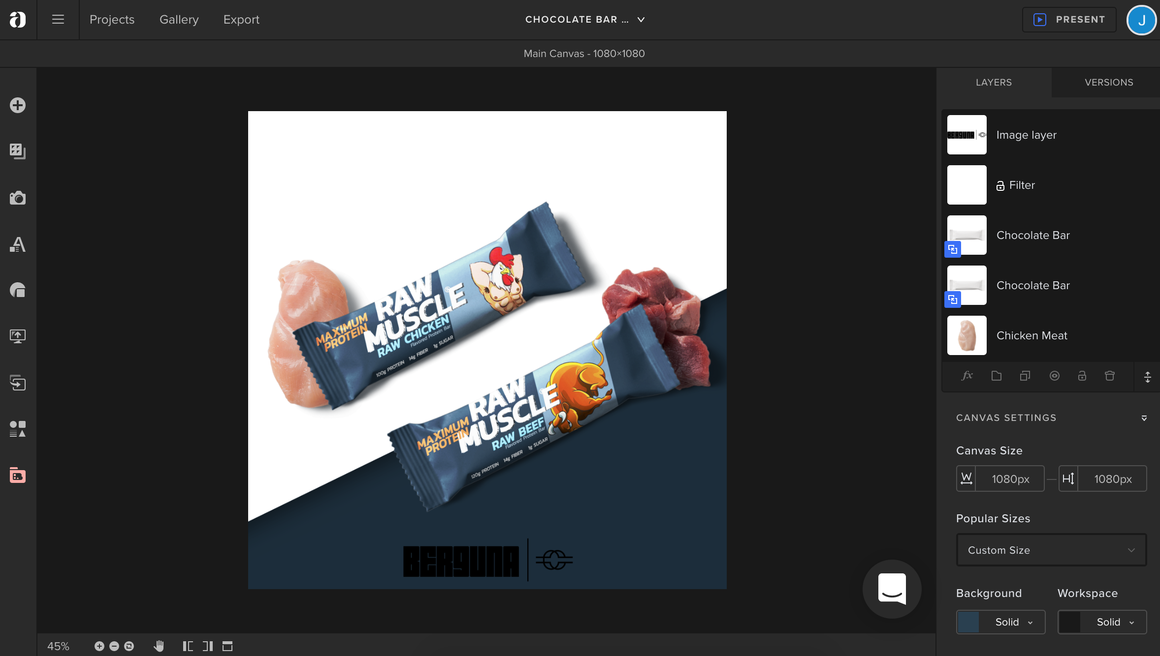
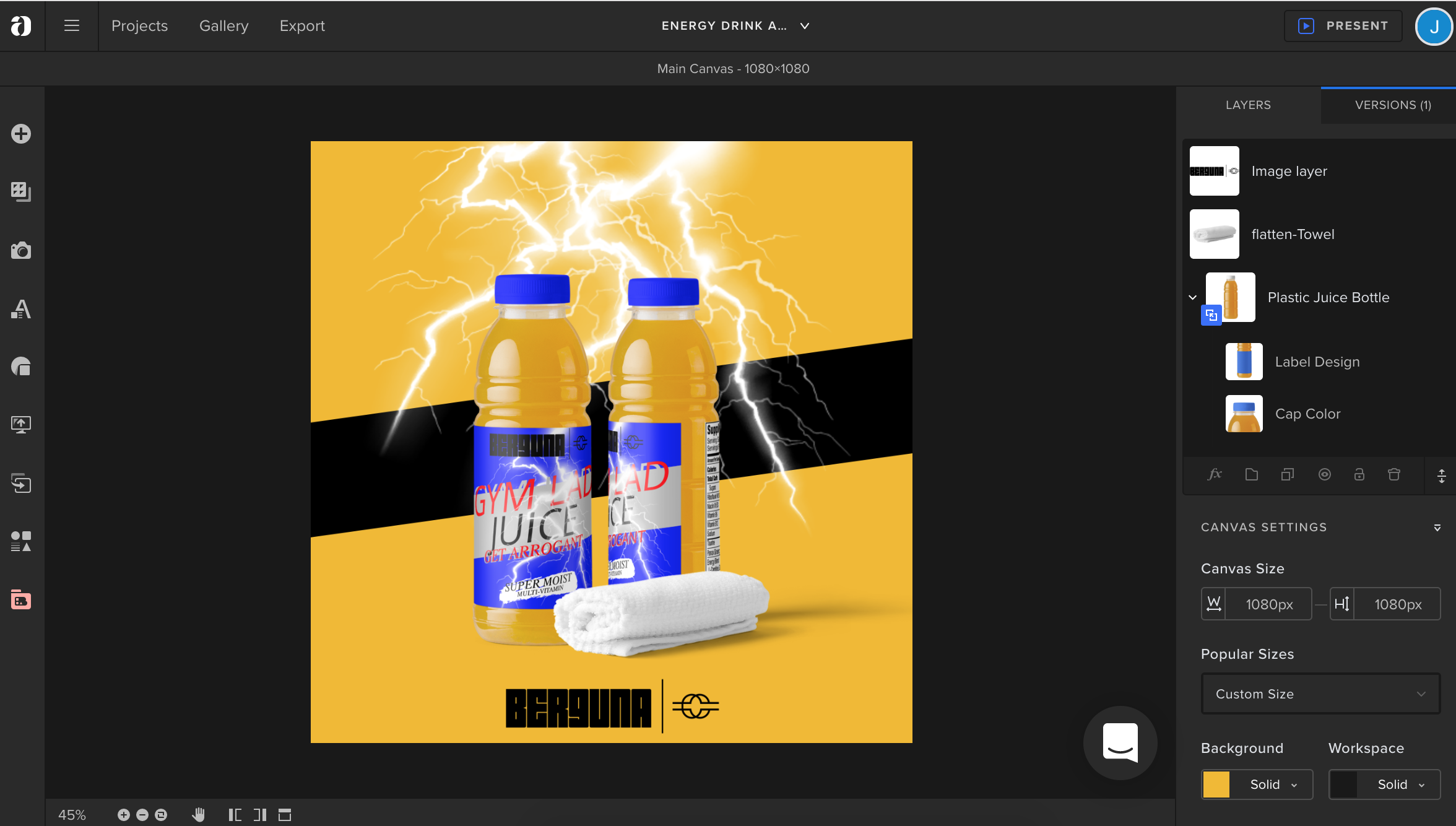
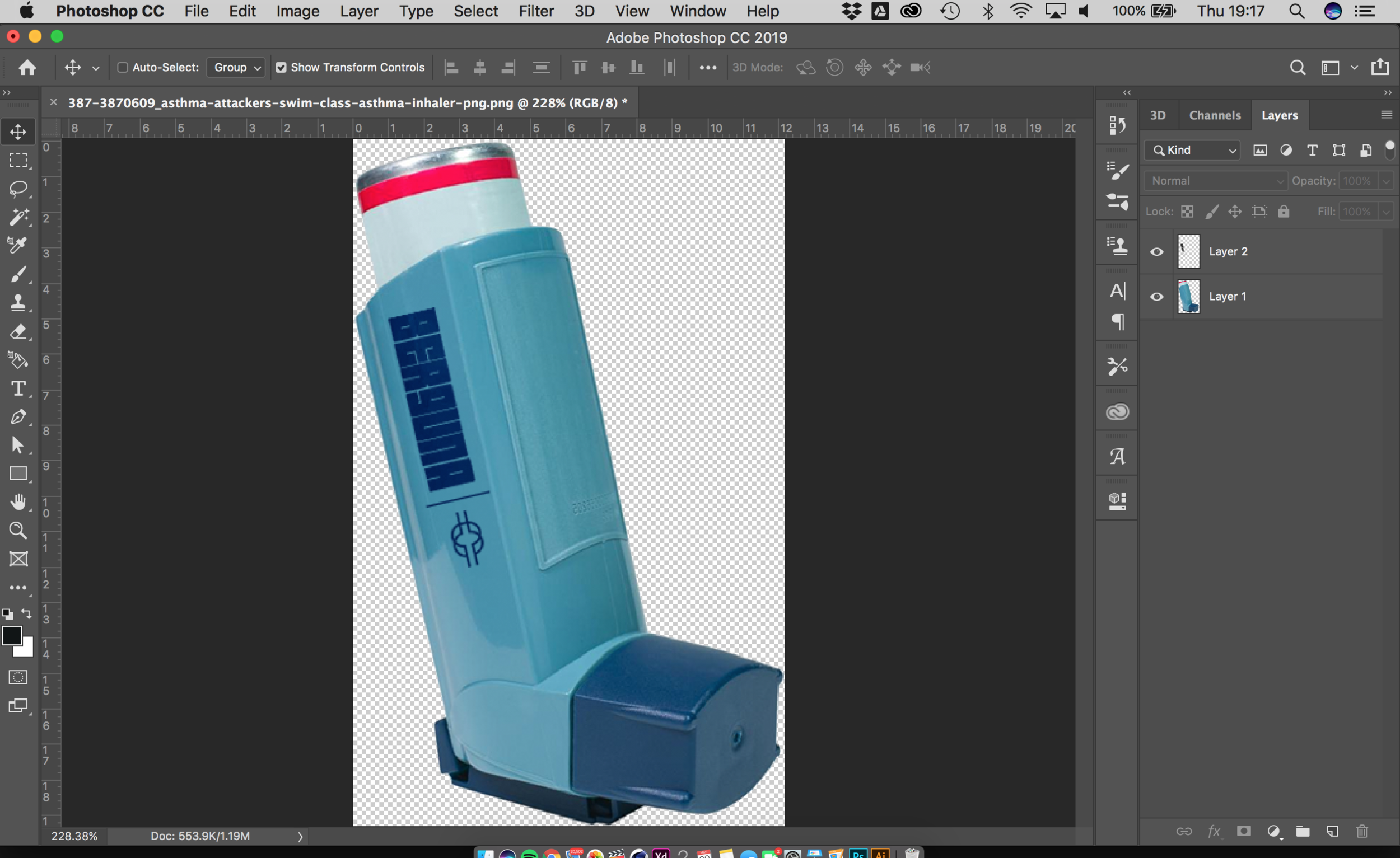
The designing of the products and their packaging was probably the most enjoyable part even though this whole project was entertaining. As it allowed me to put a twist of each of the products via a design. For example the dust inhaler was a personal favourite as I stuck to the similar design of genuine inhalers just adding my style. It was important before I jumped into designing the products to find a system where I could execute each one to a high clear standard. This was fine as I stuck to some basic guidelines such as size, resolution, elements of each product and finally ensuring it sort of told you what it was on the tin. I ended up generating 15 different unique products. The good thing about this project is that even though I had only done 15, I have a whole document full of them, so this project I am planning on rolling on in the future as a side hustle thing. As it puts to work my ability to look at products creatively and differently, I can execute them easily and with my other output being a brand instagram, i hope to grow that page prior to leaving university.
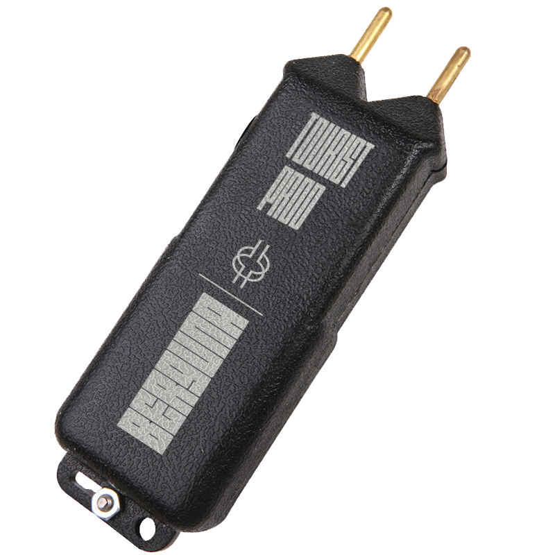
For some products It was a case of tailoring elements myself such as the Tourist Prod which you can see above. This was a simple process of using photoshop and moulding together different parts of my brand. This way even the physical products within the packaging gave off the impression these had been made in real life.
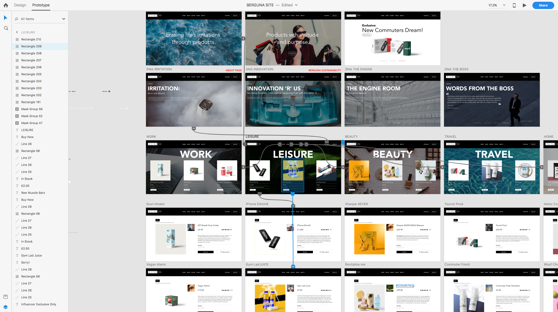
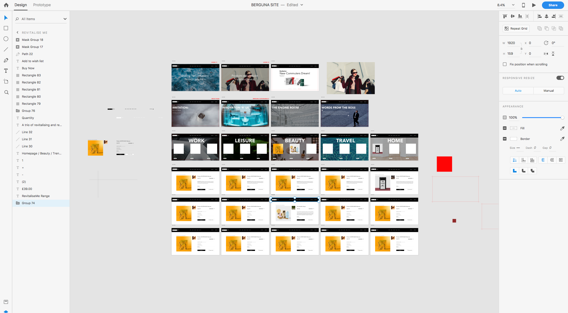
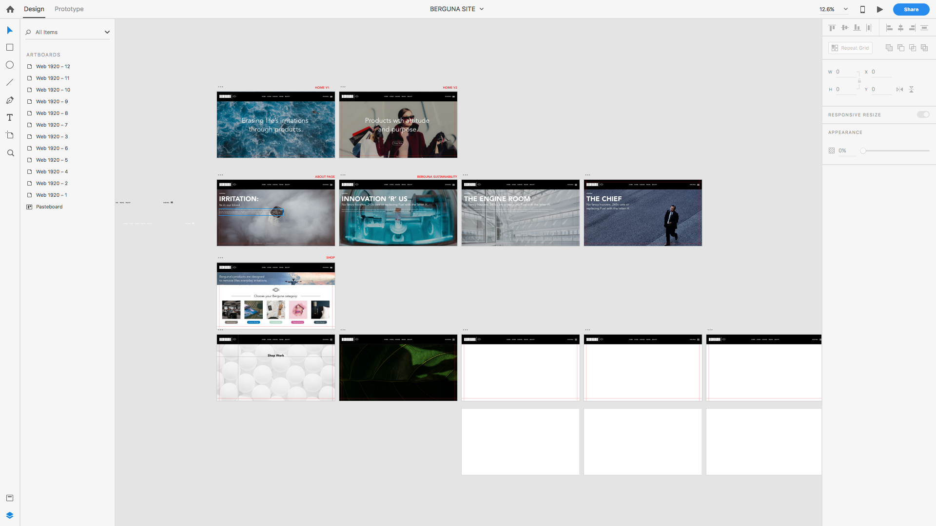
Above you can see the design process in Adobe XD during the four intense days I focused on designing this interface. I decided to showcase three trending products each for each of the five categories with a simple click which then navigated you to the individual product page. In total there were twenty seven pages for the whole UI. Which could have been less or more to be honest but for what it is, Beta version, I felt was perfect. Other decisions I made during the UI design was to include a similar background style using high resolution images unique to each page of the UI.
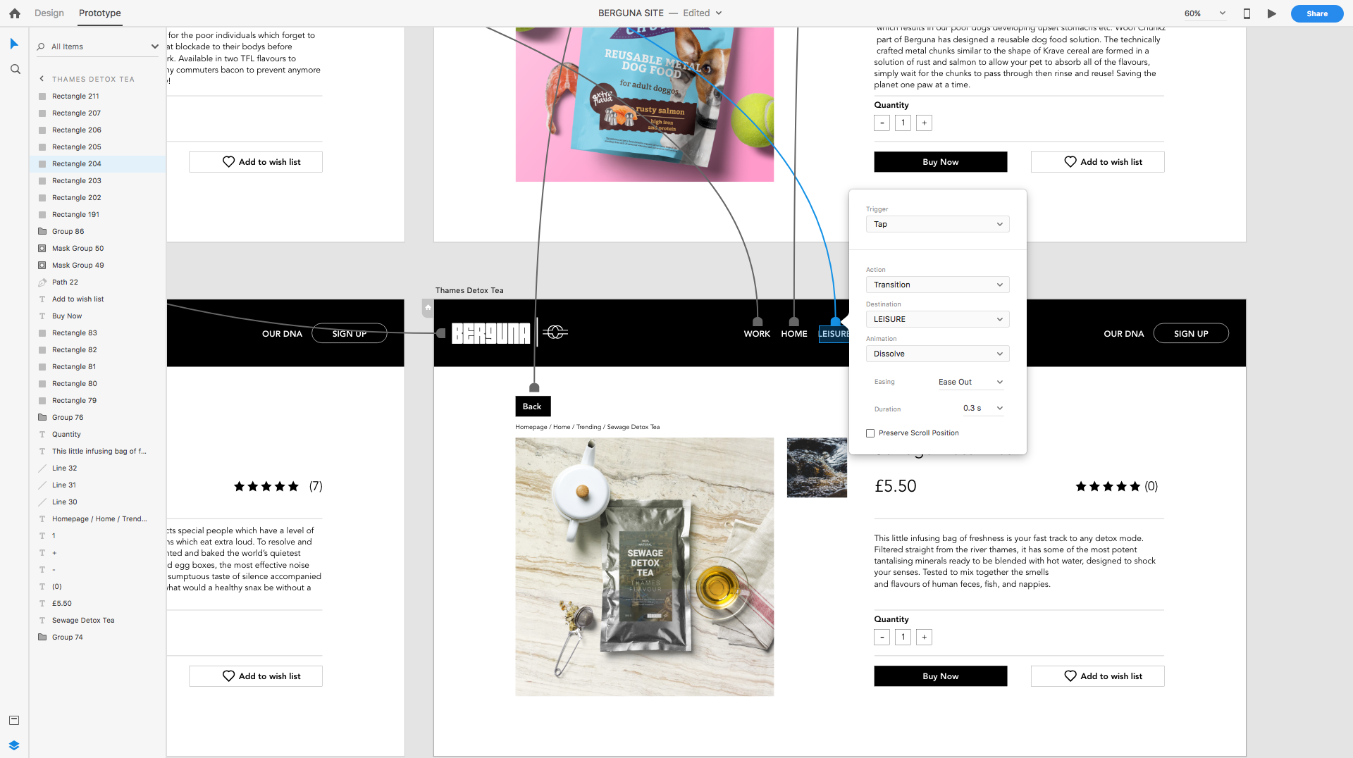
After the 27 pages were designed, the next step to finalise this output was to begin with the live prototyping stage in XD. This was a major feature which I wanted to use in XD to showcase and present my website, as well as at the degree show having the website showcased on my monitor for visitors to be able to use the beta version. This was something I clocked towards the end of the prototyping process, which added a whole new element to making it come alive via prototyping. Once surrounding the relevant elements of each page with an invisible bounding box, I just linked the landing page relevant. Then I simply published the file on XD to a review active link to then place into my submission deck for my tutors marking to play around and view Berguna online.
Overall this stage of the project like I have said was the most enjoyable but taxing. The final steps for me left on this project was to focus on the social aspect of my other output, uploading my products in a three column format whilst tagging in relevant or controversial companies into the posts.